- Case Study
Wiser Design System
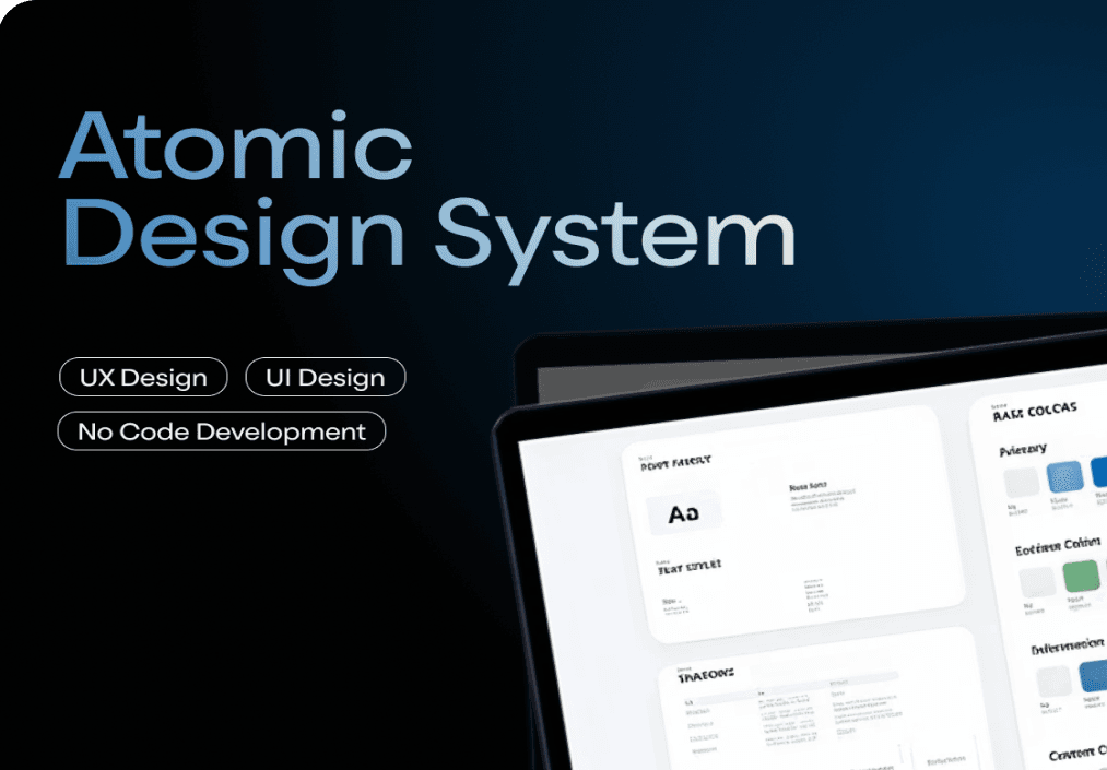
A scalable UI component system designed to unify multiple products and improve design and development efficiency.
200+
Components
+35%
User Efficiency
+20%
Data Accuracy
Role
Product Designer
Scope
Design System / Multi-product SaaS
Year
2024
- Context
Wiser Solutions operates multiple products built over time using different design patterns, UI styles, and code bases.
As these products evolved independently, inconsistencies began to impact usability, brand perception, and development efficiency. This created a growing need for a unified design system that could scale across products while maintaining consistency and flexibility.
- Problems Identified
Six core inconsistencies were holding the product ecosystem back.
Colour inconsistency across products created confusion and weakened brand identity
Navigation patterns varied, increasing cognitive load for users
Typography usage lacked standardization, reducing readability and cohesion
Multiple code bases (ANT, Material, Backbone) caused fragmentation
No centralized design system existed to guide UI decisions
Icons and visual elements were inconsistent across products
- Goal
Establish a unified system that ensures consistency, reduces duplication, and creates a scalable foundation.
The goal was to establish a unified design system that ensures consistency across products, reduces duplication in design and development efforts, and creates a scalable foundation for future product growth.
- Approach
Atomic design methodology, built iteratively with real use cases.
The system was built using an atomic design methodology, focusing on creating reusable components and patterns that could scale across multiple products.
- Identifying common patterns across products
- Building reusable components iteratively
- Aligning closely with developers for implementation
- Continuously refining components based on real use cases
- System Architecture
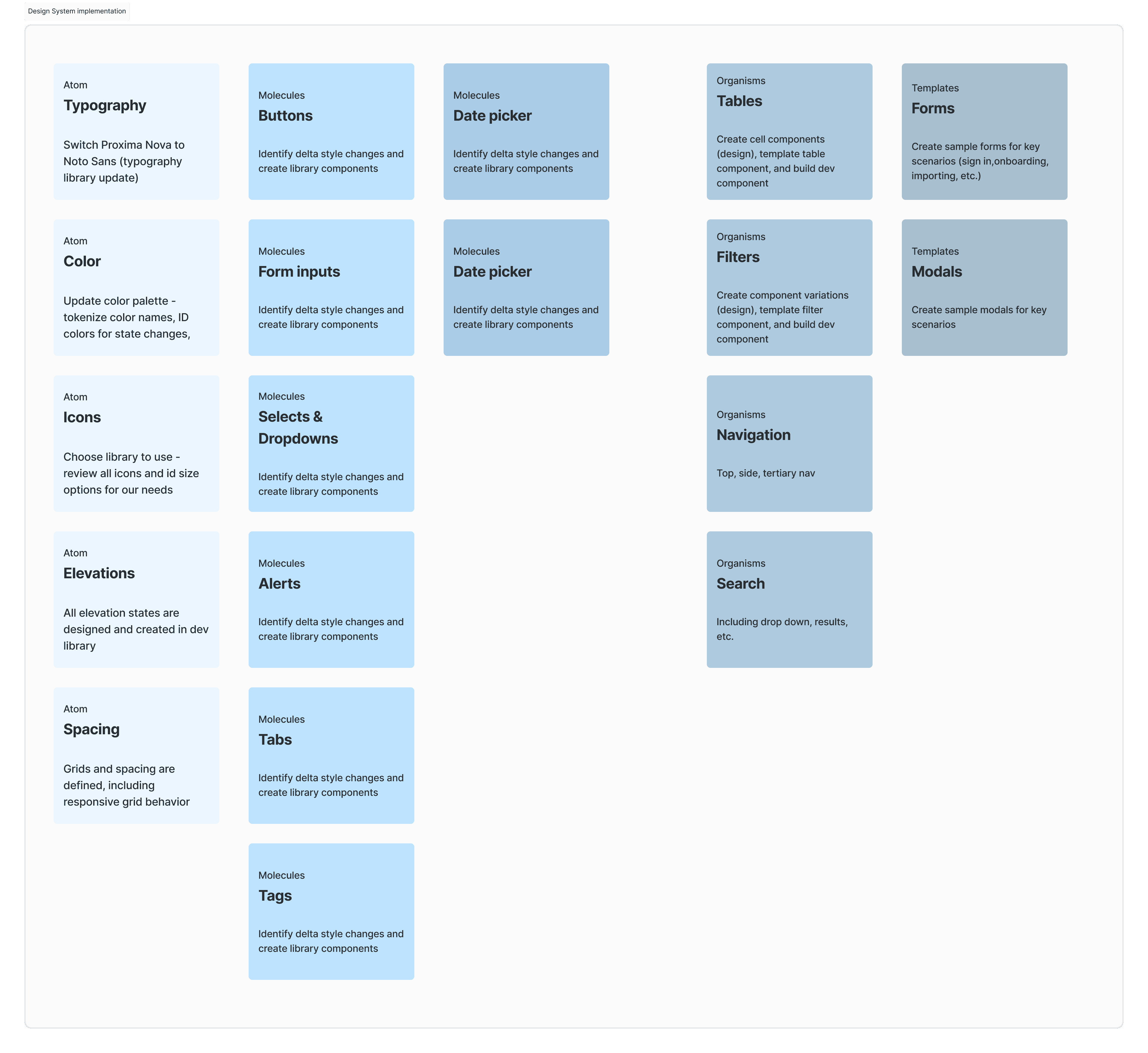
The design system was structured into four distinct layers.
The design system was structured into layers, each building on the one before it to create a cohesive and scalable architecture.
Foundations
color, typography, spacing
Components
buttons, inputs, navigation elements
Patterns
layouts and interaction flows
Product-level
implementations
- Component System
200+ components built with modularity and consistency in mind.
From foundational elements like typography and colors to complex UI components, the system provides everything needed to build cohesive product experiences.
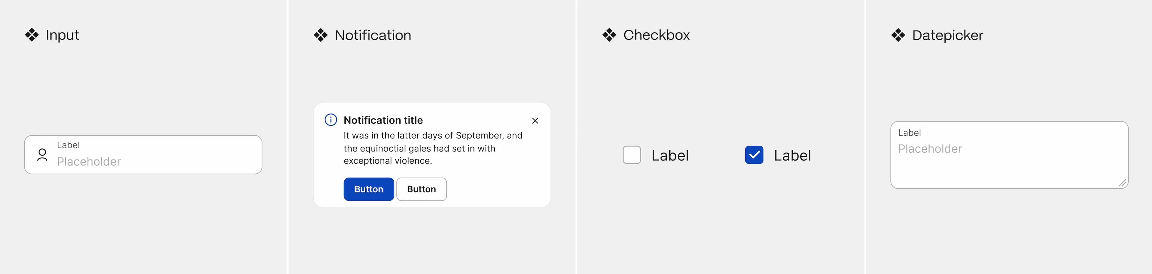
States & Variants
Multiple component states including hover, active, disabled, and error states

Responsive Patterns
Adaptive layouts and components that work seamlessly across all device sizes
Clear naming conventions for cross-team clarity
Defined states and variants for all components
Responsive behavior across all devices
Flexibility to handle multiple use cases
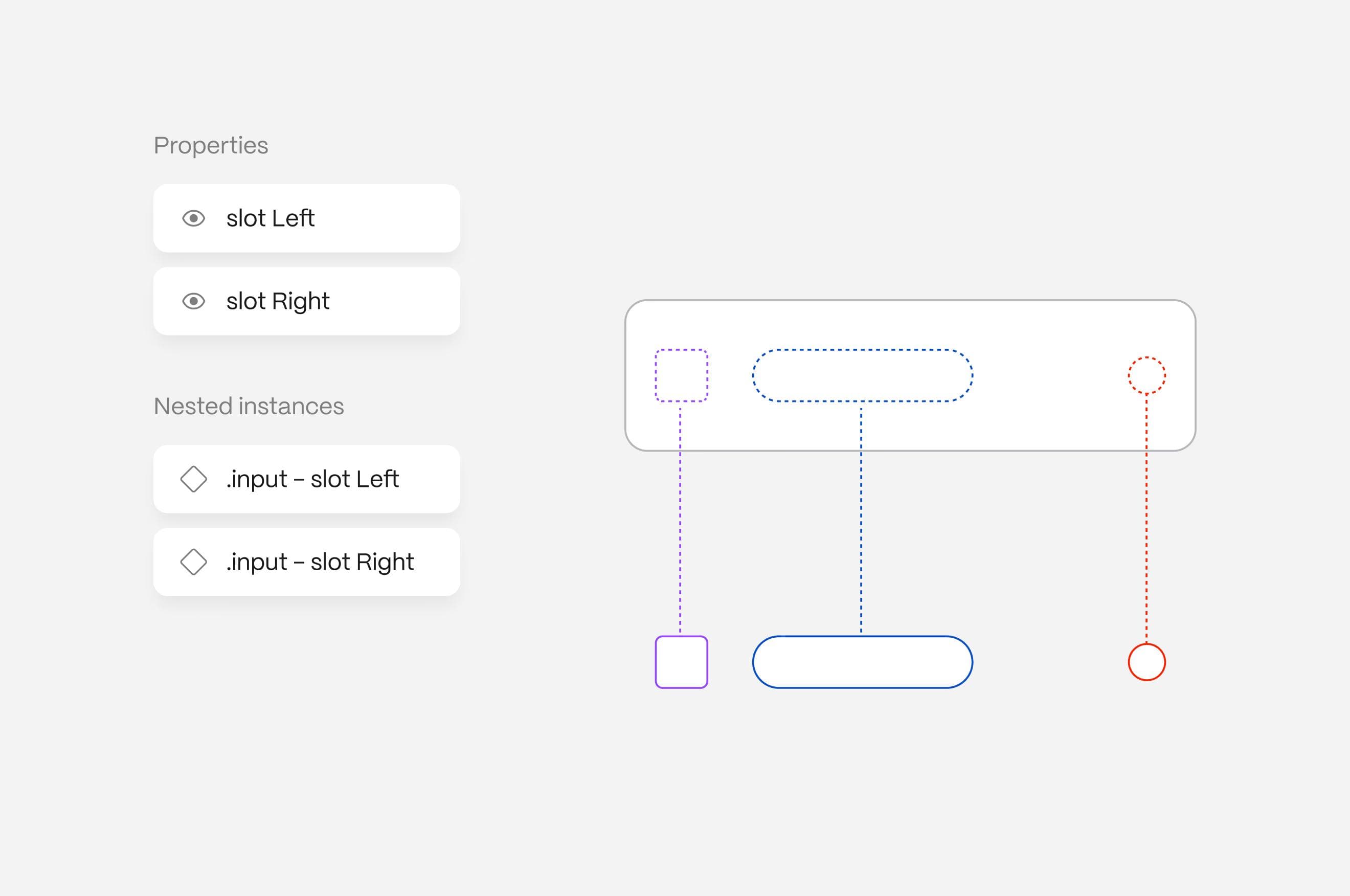
- Slot-Based Architecture
Reduce complexity while increasing flexibility through composition.
A slot-based composition model was introduced to reduce component complexity while increasing flexibility.
Instead of creating multiple variations of components, internal elements were made configurable, allowing the same component to adapt to different scenarios without duplication.
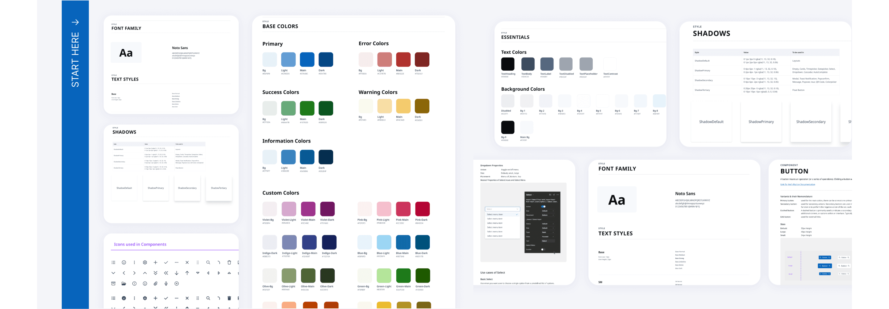
- Scalable Foundations
The system is fully powered by variables.
- colors, typography, and spacing tokens
- support for dark and light themes
- consistent border radius, spacing, and layout rules
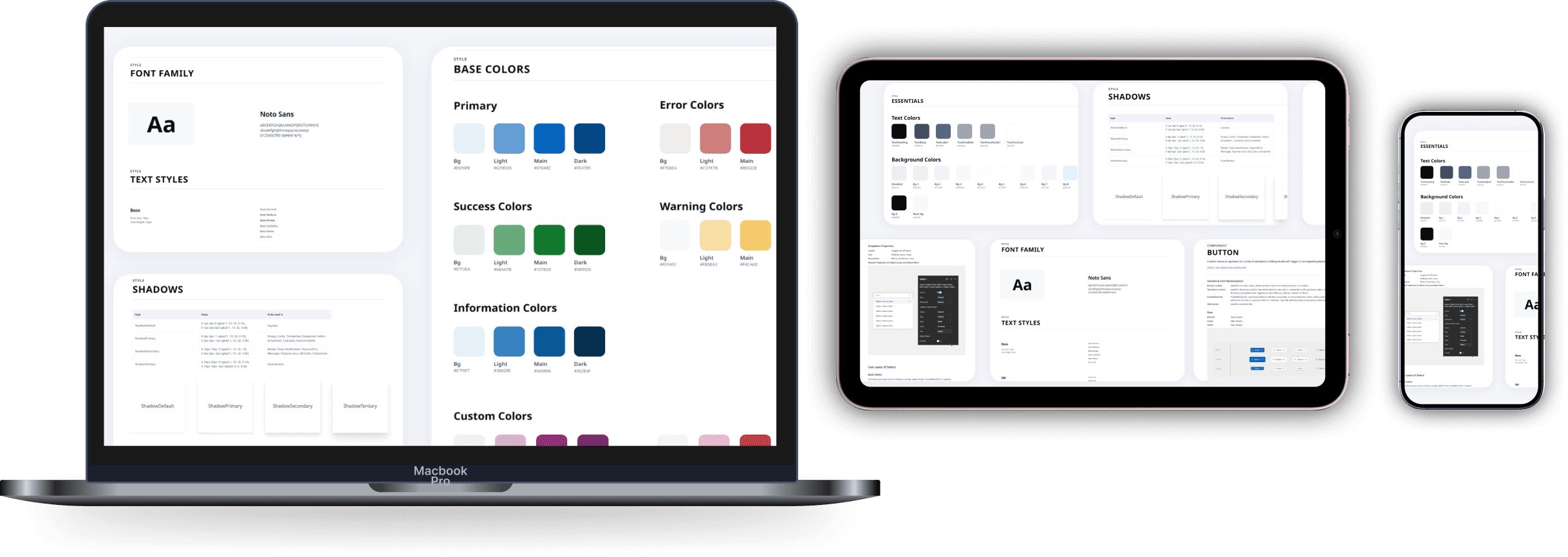
- Collaboration & Implementation
Built in close collaboration with developers to ensure alignment between design and code.
- components were validated during implementation
- documentation supported adoption
- QA ensured design accuracy in production
- Outcome
A single source of truth for UI across all Wiser products.
200+
Components
+35%
User Efficiency
+20%
Data Accuracy
- consistent user experience across multiple products
- faster design and development cycles
- reduced redundancy
- improved collaboration between teams
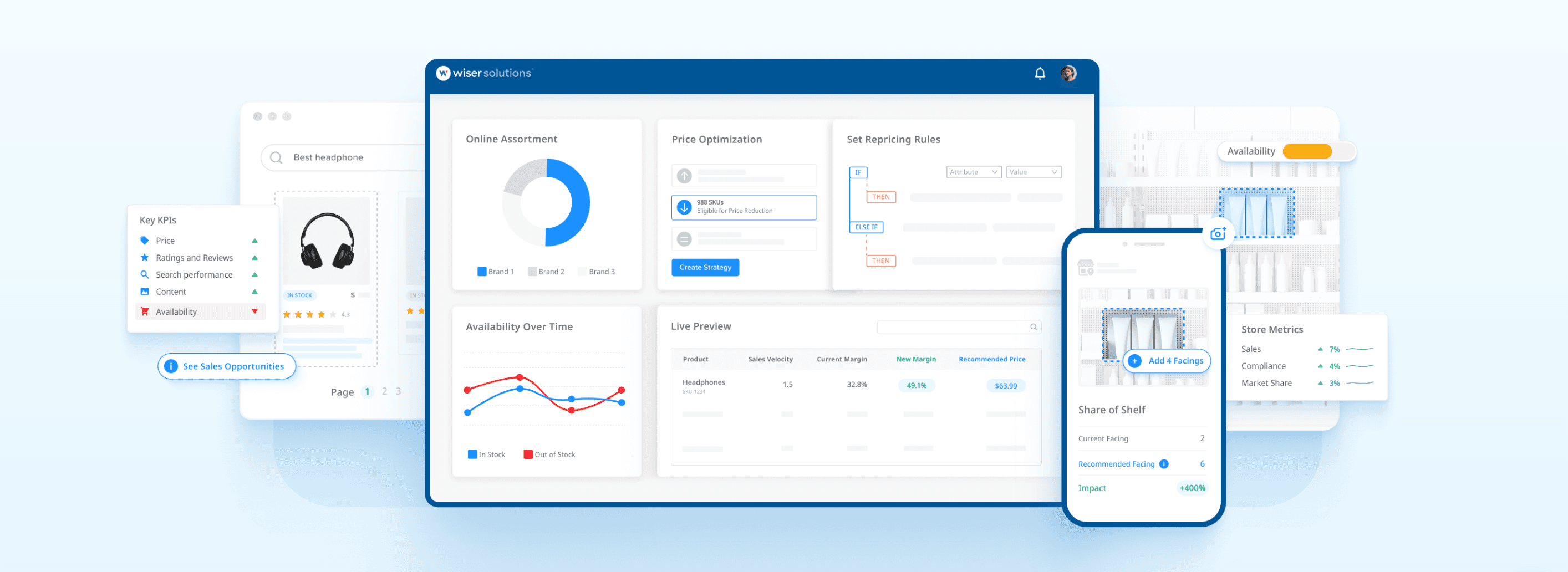
The system is now used across all Wiser products, with 200+ components actively maintained and documented.
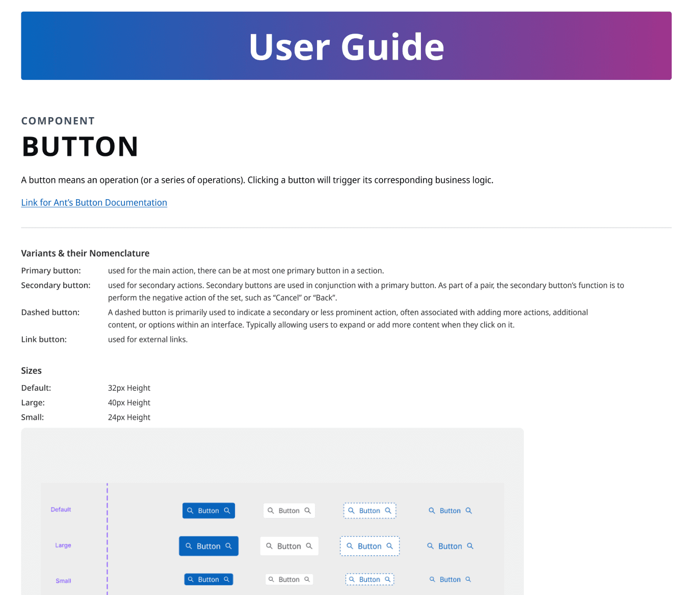
- Documentation
Comprehensive documentation to support adoption and maintenance.
- detailed component documentation
- usage guidelines and best practices
- API documentation for developers
- Reflection
Design systems are not just UI libraries; they are foundational infrastructure for product scalability.
Balancing flexibility with consistency was key to ensuring adoption across teams. The success of this system demonstrated that investing in design infrastructure pays dividends in speed, quality, and team alignment.
Thank You
For taking the time to explore this case study
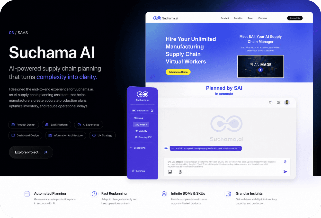
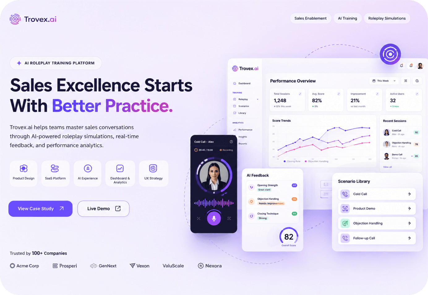
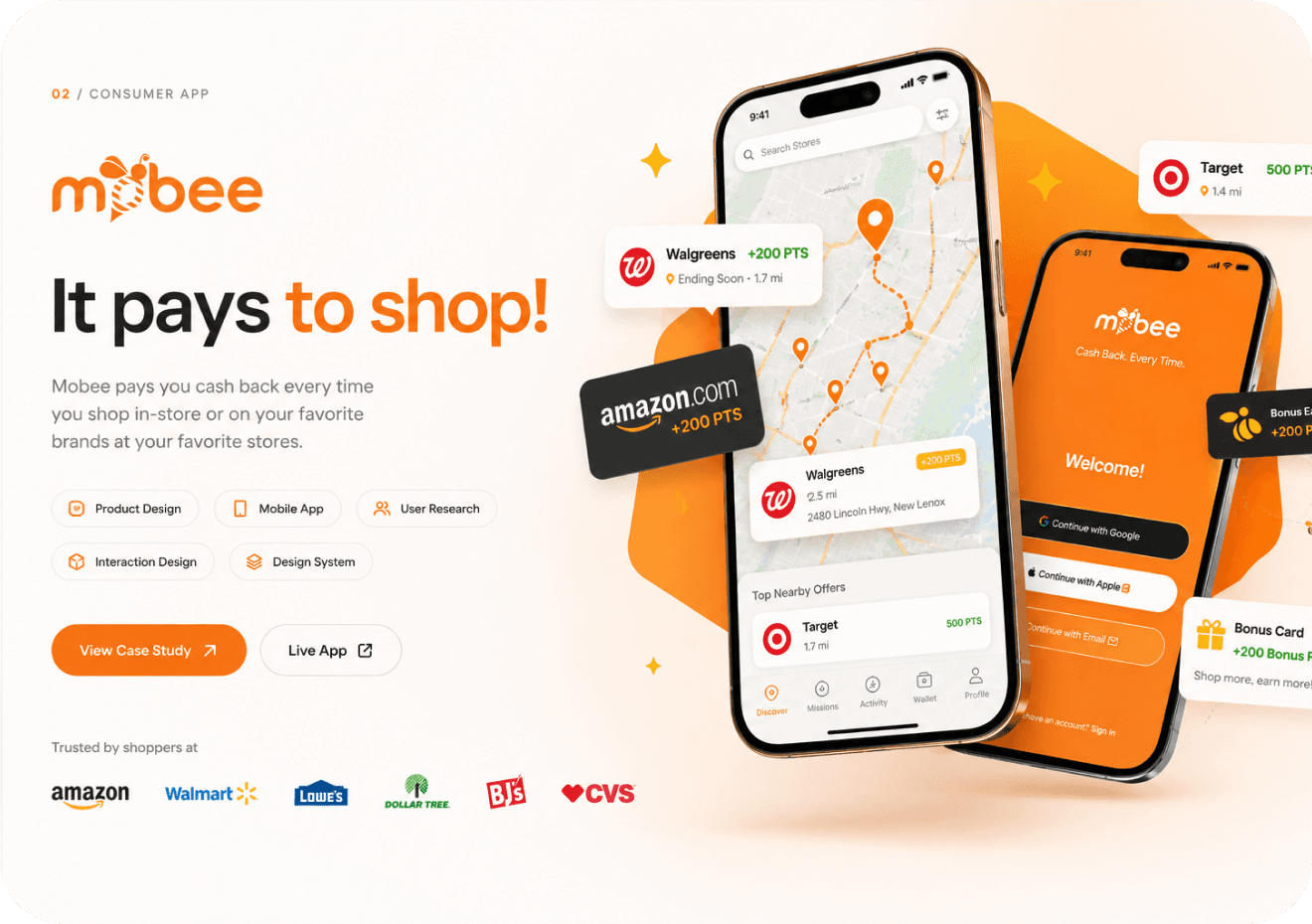
- More Case Studies
Explore the full collection of work
Building something ambitious?
Building something ambitious? I'd love to help turn complex ideas into products people genuinely enjoy using.