
Product Design Case Study · 2026

Designing one ecosystem for everything a pet owner needs

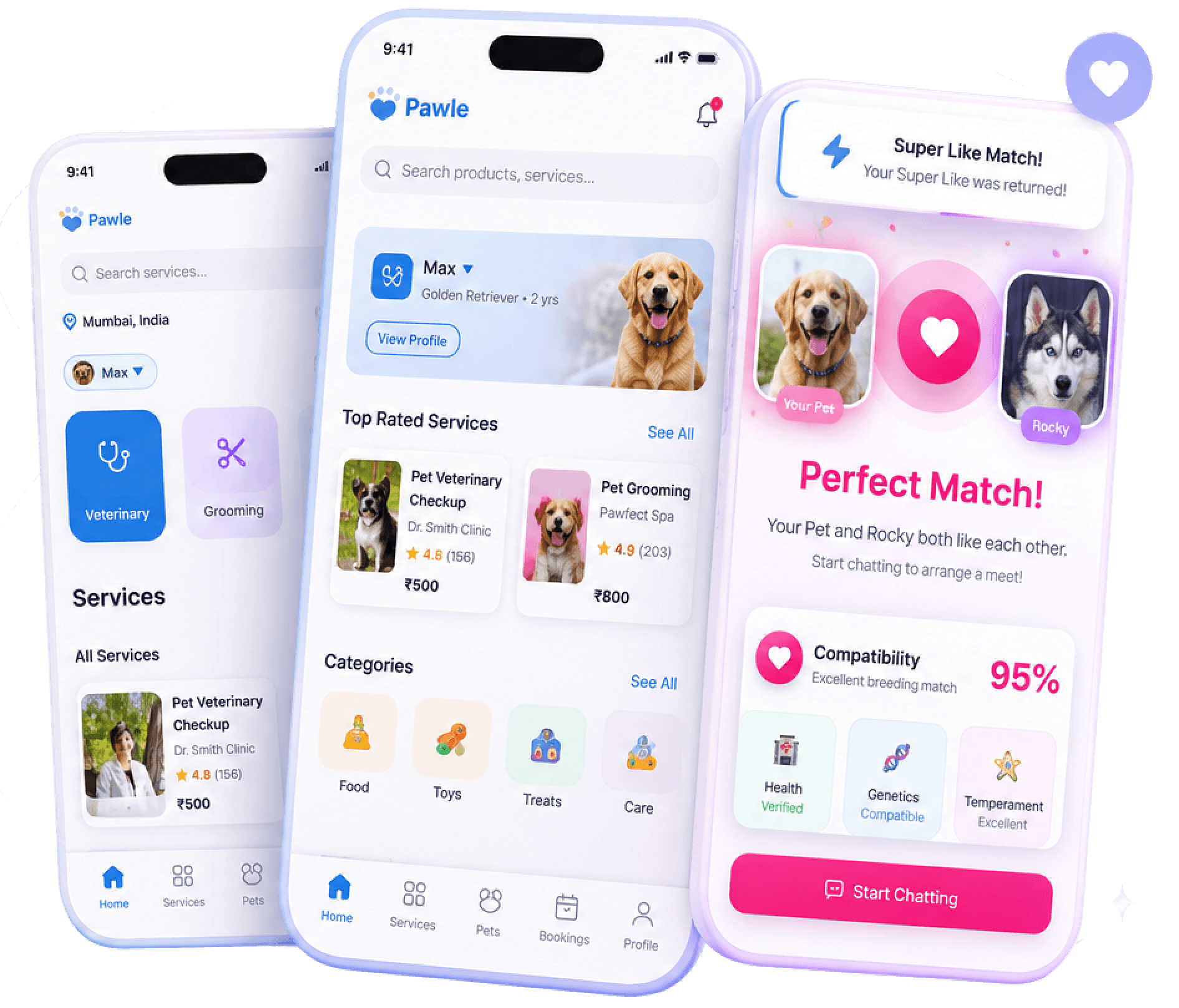
Pawle brings veterinary care, pet services, commerce, health records and community into a single product, reducing fragmented experiences across the pet care journey.

195 screens. 23 flows. One coherent product.

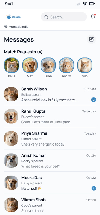
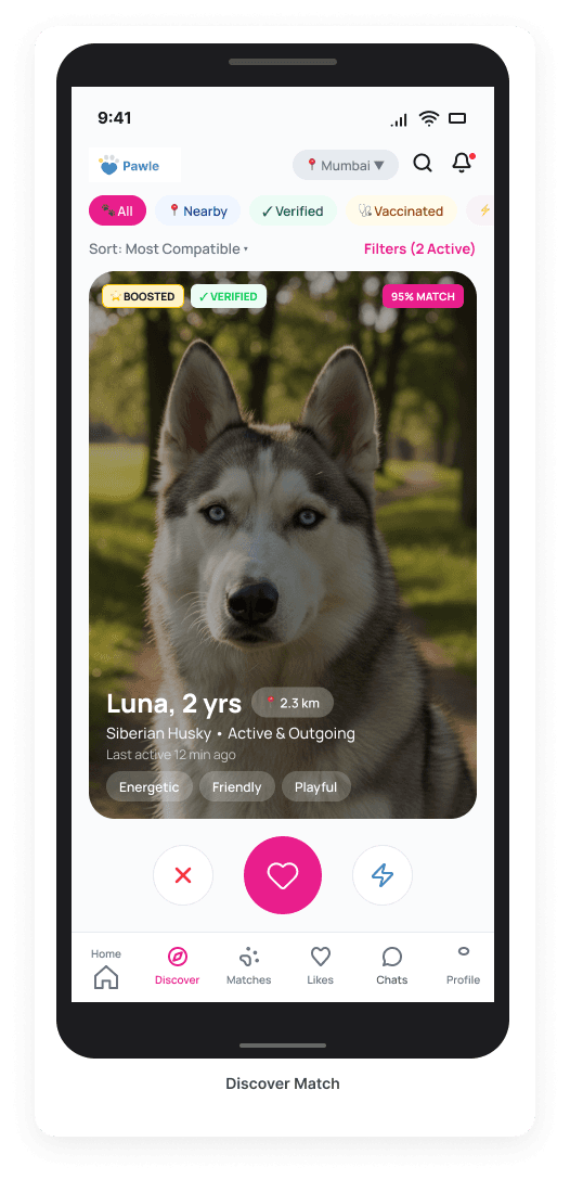
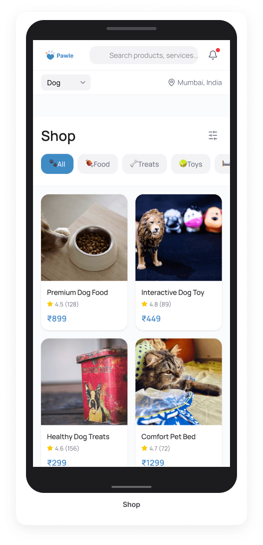
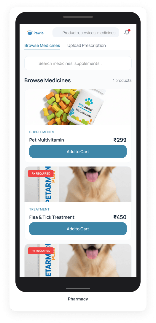
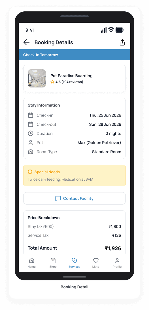
Pawle pet care app — mobile booking, health overview, and matching screens

00 - My Role

Duration

6 Months

Platform

iOS

Scope

0 → 1 Product

Team

Founders · Engineering · Product

Worked closely with the founding team to shape the product from concept to production.

I Owned

Every discipline.

Product Strategy

Product Discovery

User Research

Product Architecture

Design System

UX Design

UI Design

Prototyping

Design QA

Developer Handoff

Deliverables

By the numbers.

195

Screens

23

User flows

12

Service types

1

Design system

6

Months duration

4

A/B tests run

Outcome

Designed and delivered a scalable, production-ready platform that powers the entire pet ecosystem experience.

The opportunity wasn't another pet app. It was replacing six disconnected experiences with one cohesive product.

Product Strategy

One ecosystem for every pet service, One trusted experience.

Market Gap

No dominant pet platform in India's ₹12,000 Cr market.

Network Effects

More pet owners → more service providers → better availability → more owners.

Retention Loops

Book vet → set reminder → health record → next booking. One action pulls the next.

Monetisation

Pawle Plus subscription + service commission + pharmacy margin + shop GMV.

North Star Metric

Weekly Active Pet Owners — pet owners who use Pawle for at least one action per week.

‘I added this framework after realising I was designing features without a filter. Every decision had to pass: does this increase weekly active pet owners?’

Competitive Positioning

The only platform that covers every pet need — from vet visits to community.

Existing players focus on one or two verticals. Pawle is the first ecosystem that integrates booking, services, commerce, health records, and community — creating a sticky experience that keeps pet owners coming back.

DimensionsPawleSupertailsHUFTPetKonnectStandalone vet apps
Vet Booking
Grooming / Services
Pet Shop
Health Records
Mating / Community
Subscription Tier

Note: Pawle is the only platform that covers all dimensions — creating a cohesive experience that reduces fragmentation and increases retention.

Field Research

Research changed our assumptions.

- in-depth interviews · 4 cities · 2 weeks

‘“I have four apps on my phone just for my dog. The vet booking app, the food delivery app, the grooming WhatsApp chat, and one for vaccination records. It's genuinely exhausting.”’

- Priya S., 29, Mumbai, Labrador owner

‘“I don't know who to trust. Anyone can make an app and call themselves a verified vet.”’

- Arjun M., 24, Bangalore, first-time cat owner

87%

struggle to find same-day vet availability

78%

would pay for one unified pet app

65%

interested in pet matchmaking or breeding

71%

would spend ₹2,000+/month on pet care

The interviews revealed something different. People weren't looking for another marketplace. They were exhausted by switching between disconnected products throughout a pet's lifecycle. This shifted the design challenge from finding better services to creating one trusted operating system.

The People I Designed For

Two very different mental models. One product.

Designed for two people who'd never meet.

Pet owners and service providers have opposing mental models: one is focused on care and convenience, while the other is focused on availability and relationships. The challenge was to design a single product that bridges these two worlds without compromising either experience.

Priya, 29 · Mumbai · Dog Owner

I just want one place to book, track, and remember everything — without switching apps.

Ravi, 34 · Bangalore · Groomer

If I can manage my schedule and client history in one place, I can focus on the pets.

One product. Two truths.

Pet Parent

Needs

Booking

Care

Pawle

Service Provider

Availability

Appointment

Relationship

By mapping the two journeys, we created a product where every feature serves both sides — without duplicating effort or introducing friction.

User-CenteredTrust-FirstScalableDelightful

A Turning Point

“Halfway through the project, I realised I wasn't designing screens anymore. I was designing rules. Once the system clicked, the remaining 120 screens became predictable instead of overwhelming.”

- Me, six weeks into the project, at 11pm

Platform Modules

I want to show you how I think, not just what I made.

I could show you all 23 flows. Instead I'll show you the five that taught me the most about product design.

Information Architecture

Architecture became the product.

  • Most marketplace apps organize features around business categories. Users don't think that way.
  • Pet owners think in moments — ‘My pet needs help’, ‘My pet needs food’, ‘My pet needs a companion’.
  • The navigation was organized around user intent, not business verticals.

Why Mating has its own sub-nav: “When users enter Match, they enter a different emotional context. Pink accent, different tabs. This isn't inconsistency - it's intentional product design.”

Emergency was never in the booking wizard. I made it a permanent banner. Discovery time dropped from 8 seconds to 1.2 seconds. That's a life-safety decision.

V1 - Failed

Home | Shop+Services | Match | Profile

Services hidden from view

V2 - Discarded

Home | Shop | Services+Match | Profile

Match feature buried

V3 - Shipped

Home | Shop | Services | Match | Profile

✓ Shipped - 89% task success

VetGroomingWalkingBoardingTrainingEmergencyTaxiDay CareVaccinationMore

Product Decisions

Every navigation decision had a reason.

Key decisions that shaped Pawle into a more intuitive, empathetic and purpose driven experience.

01

Decision

Why Services became its own tab

Alternative

Everything inside Shop.

Why Rejected

Users mentally separate purchasing products from booking appointments.

Outcome

Higher discoverability. Lower task completion time.

02

Decision

Why Emergency bypasses the booking flow

Alternative

Treat emergency care like every other service.

Why Rejected

Emergency situations require immediate action - not form filling.

Outcome

Critical services accessible within seconds.

03

Decision

Why Pawle Match became its own experience

Alternative

Treat breeding as another service.

Why Rejected

Pet matchmaking is emotional rather than transactional. Mixing it with utility features confused users during testing.

Outcome

The experience feels intentional without disconnecting from the core product.

Decision log v2.4 (Q1 2025)

User Testing

Architecture

Accessibility

Scalability

The System

The system behind every decision.

A unified navigation system designed to make the product easy to learn, effortless to use and consistent across every touchpoint.

01

Task-First Navigation

Five key tabs designed around how users think, not how services are categorized.

02

Context-aware Personalization

Pawle learns your pet profile, history and preferences to deliver better results over time.

03

Smart Information Architecture

Designed service into 4 key verticals, easy to scan and navigate without confusion.

04

Consistent Patterns

Built a scalable design system for unified experience across all modules.

The System

Systems before screens.

Rather than designing screens independently, the product was built from a reusable system first. Every colour became a token. Every spacing value became a scale. Every interaction became reusable.

This allowed 191 screens to be designed with minimal visual drift while making future product expansion significantly easier.

Pawle app screen showing a puppy photo

Pawle Match

A new Goldie is nearby

NOW

Colour Tokens

Primary Blue

#3F8CC4

Main brand, CTAs

Mating Pink

#E91E8C

Matchmaking sub-brand

Health Green

#10B981

Verification, Success

Action Red

#E7000B

Emergency, Critical

Neutral-900

#101828

Primary Typography

Neutral-600

#475467

Secondary labels

Neutral-100

#F2F4F7

Dividers, light bgs

Pure White

#FFFFFF

Card surfaces

Component Anatomy

Confirm Order

Height: 56dp

Radius: 14dp

Manrope SemiBold 16sp

Reusable

Consistent

Scalable

Future-proof

Spacing System

The 4px base unit. Everything is a multiple.

4pxxsicon gaps
8pxsmlabel spacing
12pxmdcard internals
16pxbasescreen margins
20pxlgheaders
24pxxlsection breaks

Durable

Built to last across versions

Faster audit

Tokens reduce review cycles

Typography Scale

Display

36 / 800

Design systems before screens.

Heading

24 / 600

A consistent hierarchy for every screen.

Body

16 / 400

Body text is used for descriptions, helper text, and long-form content. It should be readable and comfortable at typical reading distances.

Caption

12 / 500

Caption text is used for metadata, timestamps, and secondary labels. It provides context without competing with primary content.

Component Library Sample

Primary Button

Default / Pressed / Disabled

ConfirmConfirmConfirm

Service Card

Available / Booked

Nail Trim

15 min • $25

Available

Bath & Brush

45 min • $65

Booked

Input Field

Empty / Filled / Error

Please enter a valid email.

Tab Bar

Active / Inactive

HomeBookingsProfile

Spacing System

A 4px base unit. Every spacing value is a multiple of 4px.

4px

xs · icon gaps

8px

sm · label spacing

12px

md · card internals

16px

base · screen margins

24px

xl · section breaks

32px

2xl · component gaps

48px

3xl · section padding

64px

4xl · major breaks

Core Value Proposition

Utility Layer - 12 services. One mental model. Zero re-learning.

Every booking flow uses the same wizard skeleton: Browse → Select → Date → Confirm. I designed this pattern first, then applied it to all 12 services. When Pharmacy launched, users already understood the pattern.

Hardest Call

Emergency Care breaks this pattern entirely - it skips the wizard and goes straight to a phone call. The 1.2-second time-to-action made that the only right answer.

78

screens

12

service types

1

reusable pattern
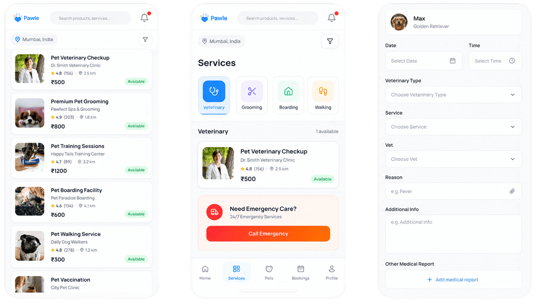
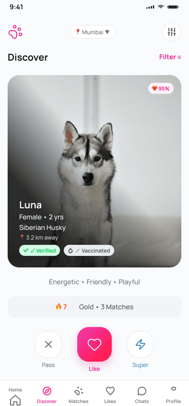
Pawle — Core Value Proposition screen

The Differentiator

The hardest problem wasn't matching pets.

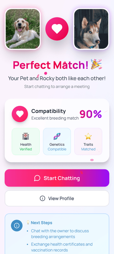
It was designing an experience that emotionally felt different without feeling disconnected from the rest of the product. Pet matchmaking involves trust, compatibility and emotional decision making. Healthcare, shopping and booking are transactional. Instead of introducing another application, Pawle Match became its own contextual environment - a dedicated navigation structure, visual identity and interaction language that creates a clear emotional transition while preserving a single product ecosystem.

WHY A SEPARATE NAV: In testing, users kept accidentally navigating away during swiping. A dedicated 6-tab Mating nav eliminated this completely. It's not inconsistency - it's intentional context-switching.

Pawle — The Differentiator screen 1
Pawle — The Differentiator screen 2
Pawle — The Differentiator screen 3

First Impression

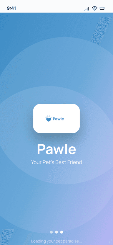
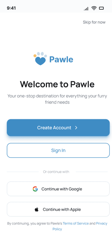
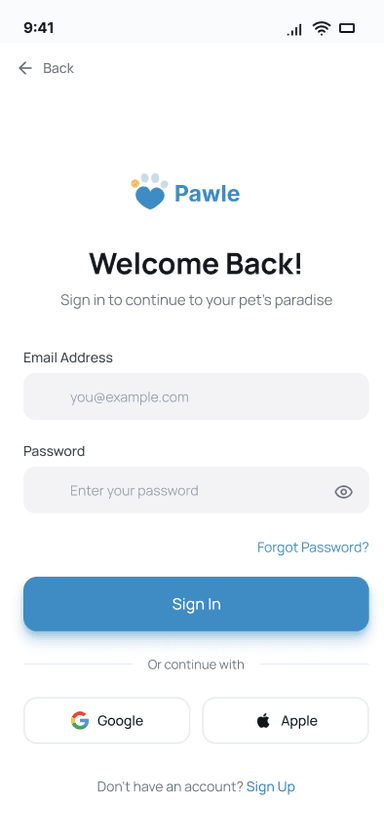
Acquisition Layer - I removed the biggest drop-off point before the user even signed up.

Our original design required account creation before access. I removed it. Added a Skip option. This sounds small. It isn't. Trust-before-commitment is how modern apps win. Users explore first, then invest.

Estimated Impact

Industry data shows mandatory signup gates reduce completion by 30-40%. The skip-first pattern was the single highest-leverage UX change in the project.

Pawle — First Impression screen 1
Pawle — First Impression screen 2
Pawle — First Impression screen 3

AI Prescription Parsing

The feature that differentiated the pharmacy module. AI-first, human-validated.

Users photograph a prescription - a scanning animation analyzes it - and the app returns per-medicine confidence scores with editable fields for unrecognized items. The UX challenge: how to show AI uncertainty without eroding trust. Solution: a tiered confidence UI - green/amber/red per medicine - so users validate rather than blindly accept. No other pet app in India has this flow.

Hardest Call

We chose to expose confidence scores instead of hiding them. This creates a clear expectation: the AI suggests, the user confirms.

3

screens

1

module

3

confidence tiers

Pawle — AI Prescription Parsing screen

The Services Pattern System

Designing 12 services with one mental model. Zero re-learning across service types.

Every service uses the same 6-stage booking skeleton: Browse → Select → Date → Confirm → Management. I designed this pattern first, validated it on Vet Booking, then applied it to all 12 services. The result: zero re-learning across service types. Users who book a vet appointment already know how to book grooming, walking, training. Species compatibility, multi-pet rules, and live GPS (for walking) are handled as optional layers on top of the core pattern, not as separate flows.

Estimated Impact

By keeping the skeleton fixed, we reduced cognitive load and increased completion rates across all 12 services.

Pawle — The Services Pattern System screen 1
Pawle — The Services Pattern System screen 2
Pawle — The Services Pattern System screen 3

Decisions, Tradeoffs & Friction

Constraints shaped the product.

Every decision balanced user needs against technical reality. Constraints included MVP launch timeline, small founding team, React Native implementation, marketplace complexity and limited engineering bandwidth. These constraints forced prioritization and made the product stronger.

CASE 01

The GPS Tracking Debate

I designed live location tracking for dog walkers - real-time GPS, parent can watch the walk live. Engineering estimated 6 weeks to build it safely. It got cut for v1. I was disappointed. But it forced a better design: live-updating “walk progress” card with distance and photos. Lower engineering cost. Users in testing preferred it.

Sometimes the constraint makes the product better.

CASE 02

The Social Feed I Abandoned

There was a whole version of Pawle with a social feed - pet photos, community tips, “Pets Near You”. I designed 24 screens for it. Then I asked: what makes this sticky before there are 10,000 users? The answer was nothing. I removed all 24 screens.

Cutting features is a product skill. I removed 24 screens and the product got stronger.

CASE 03

The Navigation that Tested Wrong

Version 1 had 4 tabs. It felt clean. Then 12 users showed me that nobody looked for “Boarding a dog” under the shopping icon. I rebuilt the navigation. V2 had 5 tabs. Users found what they needed 4 steps faster.

Clean design can be wrong design. User testing saved me from shipping a beautiful mistake.

Constraints

MVP Launch TimelineSmall Founding TeamReact Native ImplementationMarketplace ComplexityLimited Engineering Bandwidth

Cross-functional Collaboration

Throughout the project I partnered closely with founders and engineering to align product strategy, technical feasibility and user needs.
Rather than designing screens in isolation, product decisions were continuously validated through discussion, prototyping and implementation feedback.
This created a design process that was fast, grounded in reality and aligned across the team — reducing rework and ensuring the product could actually be built to the timelines we had.

→ Faster delivery. Fewer surprises. Stronger alignment.

Design Decisions That Drove Revenue

Great UX and business outcomes aren't in conflict.

These four decisions were made with both the user and the revenue model in mind. Each connects a UX choice directly to a monetization lever — reducing friction, capturing margin, driving repeat bookings, and converting subscriptions.

CASE 01

Persistent cart badge in Shop

Alternative: Hide cart until checkout is initiated.

Outcome: Reduced friction to checkout → higher Shop GMV (Shop GMV revenue lever).

Lower friction → higher GMV.

CASE 02

Prescription upload flow with AI parsing

Alternative: Manual entry only.

Outcome: Captures pharmacy margin at highest trust moment → higher conversion (Pharmacy margin lever).

Faster trust → higher margin capture.

CASE 03

Service booking confirmation with Add to Calendar + reminder

Alternative: Email-only confirmation.

Outcome: Drives repeat booking rate → higher service commission (Service commission lever).

Higher retention → higher commission.

CASE 04

Pawle Plus upsell gates on health records and priority vet slots

Alternative: Free access to premium features.

Outcome: Drives subscription conversion → higher recurring revenue (Subscription revenue lever).

Clear value → higher conversion.

A/B Testing

Every hypothesis was a bet. Here is what I won and lost.

I ran four controlled tests. I was wrong once. That wrong answer taught me more than the three right ones.

01

Hypothesis

5-tab vs 4-tab navigation

Metric Impact

28%

better task success

Version A

4-tab navigation

Version B · Winner

5-tab navigation

02

Hypothesis

Skip-gate vs hard-gate onboarding

Metric Impact

34%

higher activation

Version A

Mandatory signup

Version B · Winner

Skip for now option

03

Hypothesis

Category chips vs alphabetical list

Metric Impact

4x

faster discovery

Version A

A-Z Service List

Version B · Winner

Visual Category Chips

04

Hypothesis

Heart icon vs text 'Like'

Metric Impact

94%

recognition

Version A

Text link

Version B · Winner

Iconic heart

“When I was wrong: I initially argued for a 4-tab navigation on aesthetic grounds — it felt cleaner. The data disagreed. I shipped 5 tabs.

If This Shipped

I won't fake metrics. Here is what I expected.

Weekly Active Pet Owners

40%

Target: 40% of registered users active weekly by month 3.

Why it matters: consistent usage is the strongest signal of value and retention.

Service Booking Completion Rate

>72%

Target: funnel completion rate above 72%.

Why it matters: high completion means trust, fewer drop-offs, and more revenue.

Month-3 Retention

>55%

Target: more than 55% users return within 30 days.

Why it matters: retention is the best predictor of long-term growth and LTV.

This product was not shipped. I designed it as a 0→1 portfolio project. So I'll give you success metrics — not vanity metrics — and explain how I'd measure them.

What comes next (the roadmap)

These aren't wishes — they're the next logical moves given the retention loops Pawle was designed to create.

Phase 1 · 3 months

Live GPS Walk Tracking

The feature engineering scoped at 6 weeks that was cut from v1. Architecture is now in place. Drives daily active usage more than anything else.

→ Drives daily active usage · High retention impact

Phase 2 · 6 months

Community Social Layer

Not a feed. A context-aware social graph - pets near you based on location, breed compatibility, and service history. This is where network effects begin.

→ Activates network effects · Product defensibility

Phase 3 · 12 months

Pawle Plus Tier 2 with AI Health

Photo your pet, receive triage guidance and medication recommendations. Turns Pawle from a booking app into a health companion.

→ Premium revenue · Reduces user anxiety

Reflection

What this project taught me.

Designing 195 screens wasn't the challenge.
Designing a system capable of producing the next 300 screens was.”

01

Systems outperform screens

Every reusable decision compounds over time.

02

Product architecture is UX

Information architecture influences behaviour long before visual design does.

03

Great products are defined by exclusion

Removing complexity created a faster, clearer and more scalable experience.

04

Consistency is the strongest pattern

A consistent system reduces cognitive load and makes the product feel more reliable.

05

Accessibility is a design constraint, not a QA checkbox

Designed to WCAG AA from day one — 4.5:1 minimum contrast, 44pt minimum touch targets, iOS safe area compliance, and screen reader-compatible component names.

Good interfacessolve today's problems. Great systemsmake tomorrow's problems easier to solve.

Color Accessibility & Combinations

Pairings are designed to meet WCAG 2.1 AA contrast requirements. Use these combinations for text on backgrounds.

Primary Blue

#3F8CC4

Text on white

Primary CTA

Use for primary actions and emphasis.

AAA

Ratio: 7.3:1

Health Green

#10B981

Text on white

Success state

Use for verification and confirmation.

AAA

Ratio: 7.1:1

Mating Pink

#E91E8C

Text on white

Match highlight

Use for matchmaking emphasis.

AAA

Ratio: 6.8:1

Neutral-900

#101828

Text on white

Primary text

Use for headings and body copy.

AAA

Ratio: 14.1:1

Neutral-600

#475467

Text on white

Secondary label

Use for helper text and metadata.

AA

Ratio: 5.1:1

Neutral-100

#F2F4F7

Text on white

Divider / surface

Use for subtle separation.

Fail

Ratio: 2.1:1

Responsive Grid System

A 12-column grid that adapts across breakpoints. Desktop uses 12 columns, Tablet uses 8 columns, and Mobile uses 4 columns.

Desktop

1200px+

12 columns

Tablet

768–1199px

8 columns

Mobile

<768px

4 columns

Accessibility Standards

Key accessibility best practices implemented across the system.

Visible focus states

Interactive elements show a clear focus ring for keyboard navigation.

Color contrast

Text meets WCAG 2.1 AA requirements (4.5:1 normal, 3:1 large).

Touch targets

Interactive elements meet the 44×44px minimum touch target size.

Semantic HTML

Proper HTML structure and ARIA attributes support assistive technologies.

The Final Product

The product that shipped.

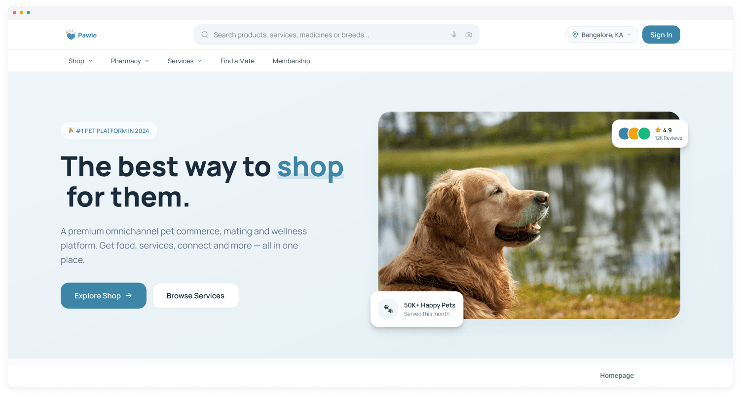
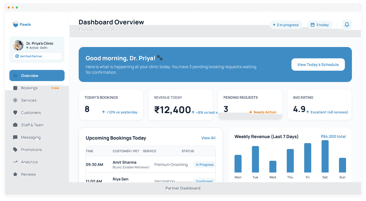
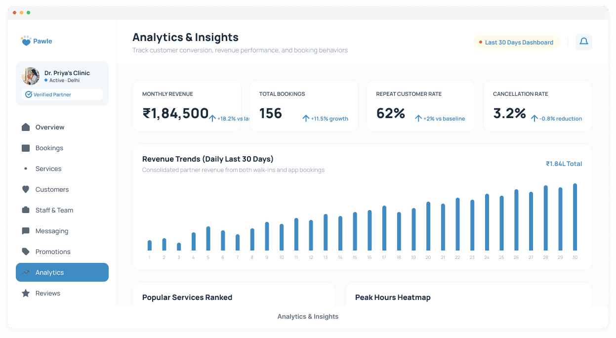
15 mobile screens and 10 responsive web pages — every touchpoint from onboarding to booking, shopping, and social matching. Built from one unified design system.

Mobile Experience

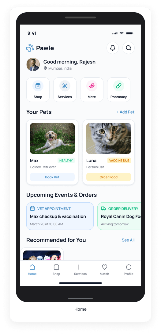
Pawle app — Home screen

Home

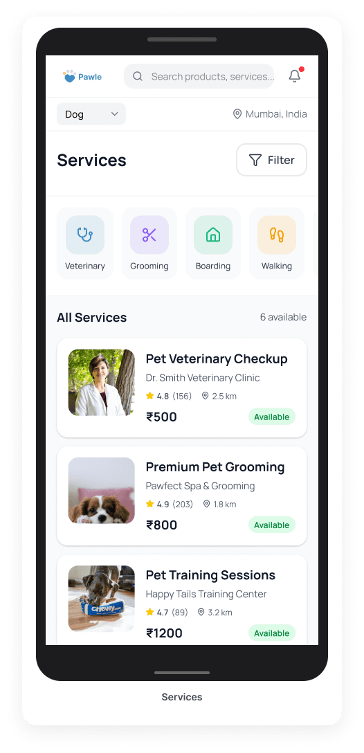
Pawle app — Services screen

Services

Pawle app — Discover Match screen

Discover Match

Pawle app — Shop screen

Shop

Pawle app — Pharmacy screen

Pharmacy

Pawle app — Booking screen

Booking

Desktop Platform

Pawle web — Homepage

Homepage

Pawle web — Partner Dashboard

Partner Dashboard

Pawle web — Analytics & Insights

Analytics & Insights

- More Case Studies

Explore the full collection of work

Building something ambitious?

Building something ambitious? I'd love to help turn complex ideas into products people genuinely enjoy using.

Get in touch